I did a few customization on this blog just to make it look more modern. Something was lacking in the old design and I felt to do a few tweaks and changes to make the page look more alive to first-time visitors and returning visitors.
I don’t update this site as much compared to my other sites; and when I do, I take time. I’m hoping that with this new ‘version’, I will feel more inclined to posting articles on a more regular basis.

- 3-Column Layout – Switched the blog from a two-column to a three-column layout to have more areas to place widgets and whatnots in the sidebars. So far, the texts and links to various pages of the website will do. But I intend to have more featured items soon.
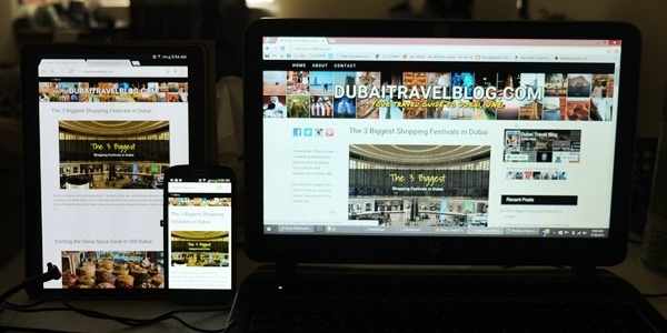
- Header – We changed the header to show more color and life. My photos are a hit and miss, but I figure I would highlight these snapshots as a background header so I can put these photos to good use. I added a tagline below the header name as well
- Sidebar – You will see some ‘recommended blogposts’ in the right sidebar when you view the blogs.
- Font – For the font, I changed to a Google Font called – Roboto, and I’ll have to find to complement it.
- Logo – I still have yet to create a logo for this page, so the generic font on the header would be fine. I have yet to come up with one for the photo watermarks.
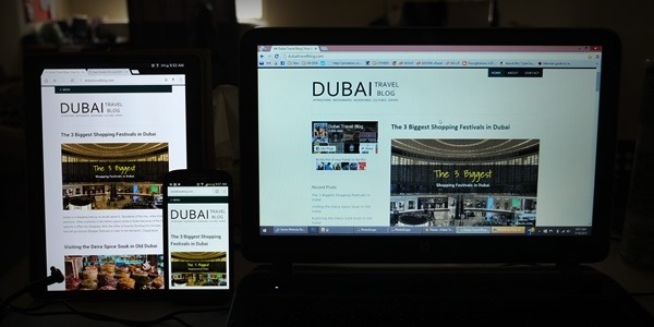
Here’s the a bad photo comparison of the old site vs the new site:
Old Look

New Look

I cannot say that this is already the final output of this redesign, because there are still some points where I want to do a few more tweaks here and there, like adding more Widgets or creating a 3-column footer. But for now, this seems like a good set-up to the direction where I want this site to go. Now let me concentrate on the structure from the backend. We hope you like this website’s new look!
